How much have I missed?
Since 2001, Adobe has updated Illustrator almost annually. Sometimes a little more, sometimes a little less. That was true until 2 things happened around 2012/2013. Adobe changed from purchased licenses to a software-as-a-service subscription model and Creative Suite was renamed Creative Cloud. Being able to push software updates from a cloud based service meant that new updates could be applied incrementally instead of being packaged into a discrete version update to be purchased.
From 2013 to 2018, Illustrator had new tools added in updates on average twice per year. Since 2018 the number of updates with new and/or improved tools kept increasing, with 6 updates in 2023.
At some point in my 30-ish years of using Adobe Illustrator I stopped reading the release notes. Many of the updates included things that didn’t apply to my business, like the perspective drawing tools, being able to rotate the view, and Kuler. With changes in my business I’ve taken a closer look at how to use the tools to my advantage. I’ve found a lot of features that I’ve missed, some for quite some time.
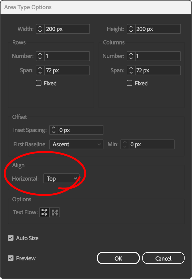
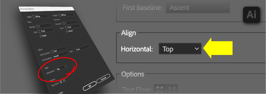
The feature that would have changed my life came in 2020… the ability to align area text vertically with the frame. Buried in the Area Type Options, something I use regularly, it went years before I noticed it. It probably didn’t help that Adobe used a name for it that doesn’t make sense to me… more on that later. Making a wild guess at how useful it would have been had I seen it sooner, this tool would have saved me maybe a hundred hours per year. One of my biggest tasks has been to make several thousand flowcharts over the past decade. Having to re-align text to shape happened constantly, and this would have simplified my process.

This had been built in to PowerPoint since 1988, so its absence from Illustrator became for me a bit of a lost cause. Long ago I gave up on getting this feature that was constantly being requested in the community forums.
Now that it is here, I’m thinking about how I can use this. Historically, my method creating a flowchart box was to create two objects: a shape and a text area. The shape would get graphic styles, the text area would get paragraph styles. I’d remove empty space in the area text frame, then use the align shape tools to center the text frame left/right and top/bottom. Changes to the amount of text would make me repeat alignment step many times over the with each iteration of the graphic.
Now I’m going to do things differently. After making the shape and modifying the path to make any special shapes I need, I’m going to use the text tool to convert it to area text. Text formatting will happen as usual with paragraph styles, but with the alignment in the area type options set to center. Using the direct selection tool, I will select the path and apply a graphic style. The result is one shape for both the object and its text and the text automatically re-centers if it changes. No more resizing the area text and re-aligning as two additional steps.
I do have some complaints about this tool. The first is its name: it should be named vertical alignment. Horizontal alignment is alignment along the horizontal axis, what is currently in the paragraph formatting window for left/center/right align. Vertical alignment is top/bottom. Second is something that PowerPoint gets right. PowerPoint uses left/center/right alignment for horizontal alignment and top/middle/bottom for vertical alignment. Using middle avoids confusion. My third complaint is that vertical and horizontal alignments are not in the same place. Alignment for shapes has its own palette. Adding vertical alignment to the paragraph palette makes sense and would follow the same paradigm.
–Alex L.

